
Name Plate
Andrew Wrighta graphic designer by trade and an optimist at heart. I gravitate toward teams that build toward something better — more just, more joyful, more human.
Name Plate
Andrew Wrighta graphic designer by trade and an optimist at heart. I gravitate toward teams that build toward something better — more just, more joyful, more human.
Simple Photos
Simple Photos
Photography


CalBike
CalBike
CalBike
Communications Director at CalBike, where I shape strategy, craft stories, and fight for safer streets across California.

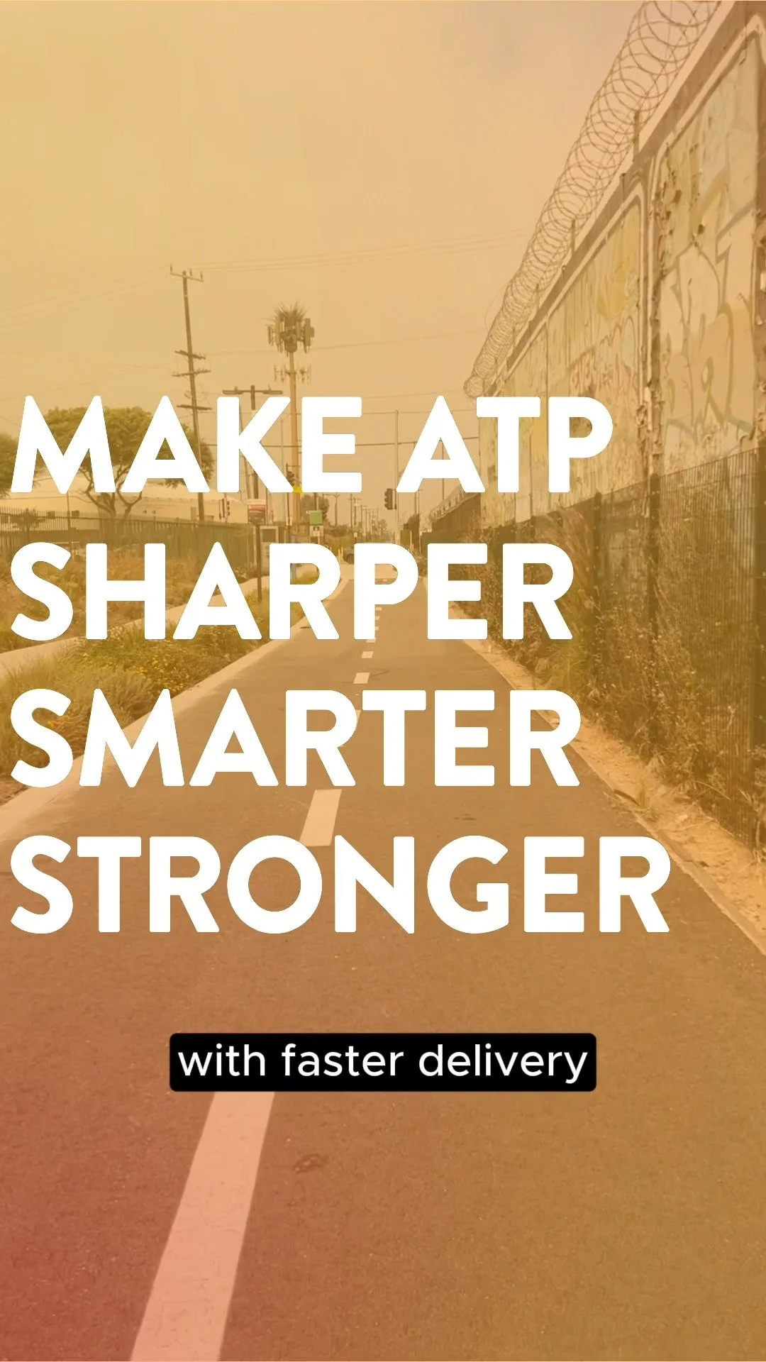
Complete Streets 2024
I crafted the messaging and design strategy behind SB 960, the Complete Streets law that forces Caltrans to build for people, not just cars, when repaving state roads a hard-fought win for safety, equity, and transparency.

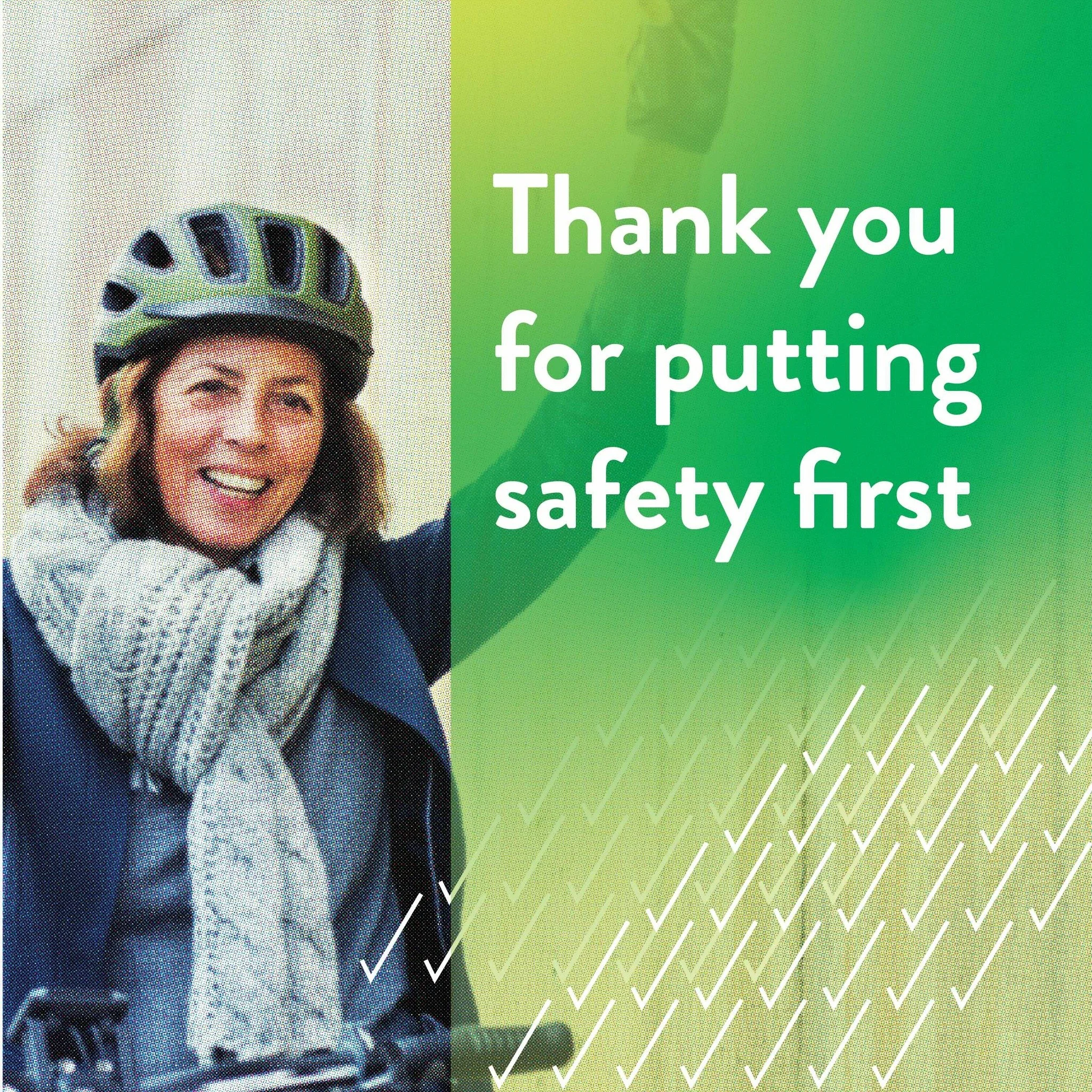
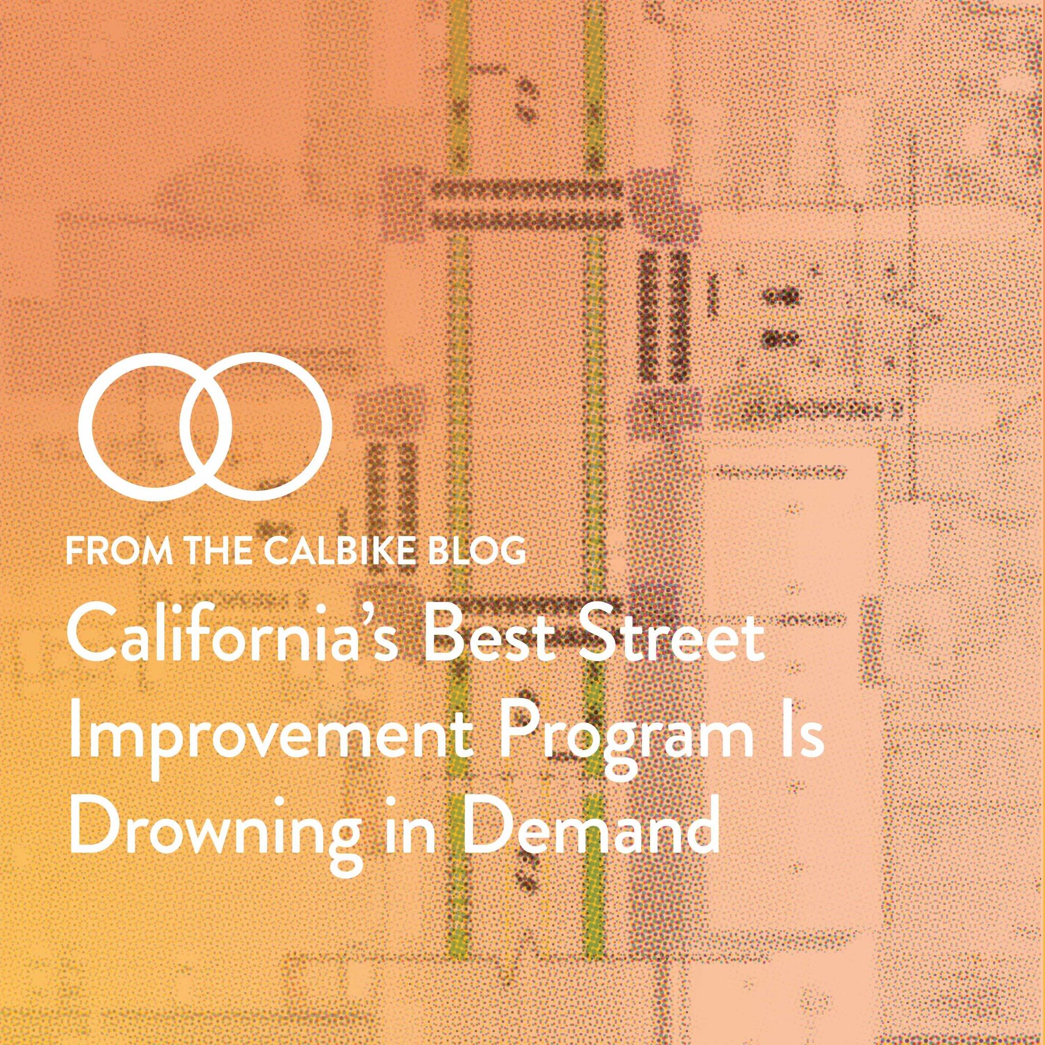
Ongoing social media
I move the social media conversation forward by making CalBike’s advocacy sharper, faster, and more human — translating policy into urgency, spotlighting unsafe streets, and inviting people to see themselves in the fight for better transportation.


Fundraising
I built a streamlined membership program and grew our base significantly by making it easier to join, clearer to support, and more rewarding to stay engaged. I focus on turning everyday donors into long-term movement builders.
Hello Friends
Hello Friends


Hello, I’m Andrew Wright.
I’m a mission-minded communications professional and a graphic designer by trade drawn to work that serves a higher purpose than self.
I’ve spent my career helping education, conservation, and equity-focused organizations communicate clearly, think strategically, and design with heart. Whether it’s messaging a movement or refining a brand, I love translating complexity into something people can feel and follow.
I’m always looking for collaborators building a more just, joyful, and livable world. If that’s you, let’s talk: andrewreginaldwright@gmail.com
Or come find me on Tuesday nights playing roller hockey at Ralph Foy Park.
Branding
Branding
Branding Projects
New Colossus Advisors
An identity shaped by intersections.
We built a brand to hold multitudes where global vision meets local wisdom, and strategy flows with creative instinct. Inspired by the nuanced work of diplomacy, design, and development, the mark reflects a world in motion: overlapping, layered, and alive with possibility.

Diane Wright Hypnotherapy
For this identity, I designed a mark that mirrors the work itself: quiet, layered, and intuitive. The logo evokes the soft guidance of a hypnotherapist. Like Diane’s practice, it holds space for what’s unseen but deeply felt.

Episcopal School of Los Angeles
A mark for a new school kind of school in Los Angeles that harkens to the academic rigor and excellence of the Episcopalian traditions.